
Help Resources
HTML
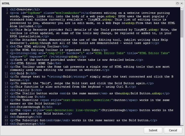
Content editing on a website involves putting words, images, links etc. into the body of a web page. XPOR uses the most popular / standard html toolbox currently available - TinyMCE. This list of editing tools is presented to you, whenever you are in edit mode, on a Web Page or Form that has the HTML Atom included.
This Help Resource provides full details of the Tools presented by TinyMCE. Note, the toolbox is regularly updated, so some of the tools may change, be replaced or added to, in your XPOR installation.
The Attached video demonstrates the use of the Editing tool, (whilst writing this Help Resource!), though not all of the tools are demonstrated - would take ages!
The HTML editing Toolbar
The HTML Editing Ribbon is organised into Tabs. Each tab is itself organised into a number of Groups, into which the buttons that can be used to configure the text have been provided;
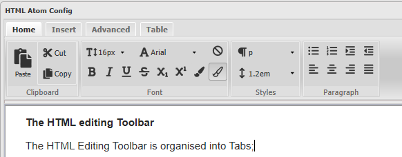
Each of the Groups and their Buttons provided under these Tabs are detailed below. Buttons have "Mouse-over" tips to assist in understanding their purpose.
HTML Editor HOME Tab
The Ribbon under the Home tab presents the most commonly used functions when editing the content on websites.
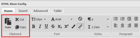
Clipboard Group - Cut, Copy and Paste
These are basic "windows" editing functions that we are all well used to. The functions these buttons provide can also be achieved using standard keyboard functions - Ctrl C / Ctrl Z / Ctr V.
Font Group
The Font Group provides access to the available font formatting tools. Swipe a section of font and click any of the buttons, to see the effect. Once changed to that font style, further text added after the change will continue in the same vein. Also, when you subsequently position the cursor into the modified text formatted section, the buttons will change / highlight to display the formatting used.
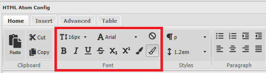
Font Size
The Font size used in the Text you enter is set by the paragraph style you select (as above). This tool will allow you to change the Font Size, in the middle of a paragraph, or to override a paragraph style.
Font Type
The Font types used in the Text you enter are set by the paragraph style you select (as above). This tool will allow you to change the Font to a different system font, in the middle of a paragraph, or to override a Paragraph style setting.
Clear Formatting
This text has a lot of formatting in it and the Clear Formatting button will quickly return it to the base style.
Bold B
To change text to "Bold" simply swipe the text concerned and click the B button.
To remove the "Bold", swipe the Bold text and click the Bold Button again.
This function is also activated from the keyboard - using Ctrl B.
Italic I
The Italic button works in the same manner as the Bold Button.
Underline U
The Underline button works in the same manner as the Bold button
Strikethrough S
The Strikethrough button works in the same manner as the Bold button.
Subscript
The Subscript button works in the same manner as the Bold button.
Superscript
The Superscript button works in the same manner as the Bold button.
Font Forecolour
The Colour of the Font in an HTML atom can be set using the Font Fore Colour button.
Font Background Colour
The Background Colour of the Font in an HTML atom can be set using the Font Background Colour button.
Styles Group
The Styles Group provides access to the Paragraph styles settings. These settings are
Line Height
The Line Height button will override the paragraph style, to set the height between each line of text that you enter. The Line Height button will override the paragraph style, to set the height between each line of text that you enter. The Line Height button will override the paragraph style, to set the height between each line of text that you enter. The Line Height button will override the paragraph style, to set the height between each line of text that you enter.
Paragraph Group
The Paragraph Group contains the paragraph formatting tools.
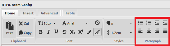
Bullets
The Bullets button will convert the text to Button list. Repeated clicking of the Button List button will remove the Button list.
- this is a button list
- this is a button list
Numbered List
The Numbered List will convert the text to a sequential numbered list. Repeated clicking of the Numbered List button will remove the Numbered list.
- This is a Numbered List
- This is a Numbered List
Increase / Decrease Indent buttons
The Increase and Decrease Indent buttons will push the paragraph of text in by a pre-determined gap from the edge of the page. It will also cycle through the various levels of Bullet and Numbered Lists.
This line has been indented
This line has been indented twice
This line has been indented three times
Text Align Buttons
The Text Align Buttons work in the same manner as the Bold button;
Left Align - this is the default!
Centre Centre Centre Centre
Right Align Right Align Right Align
This is text that has been Justified using the Justify button. Note that the same alignment will work for images and tables. This is text that has been Justified using the Justify button. Note that the same alignment will work for images and tables.
HTML Editor INSERT Tab
The Insert Tab houses two Groups of buttons, which enable the user to Insert features onto the web page ... such as this image!
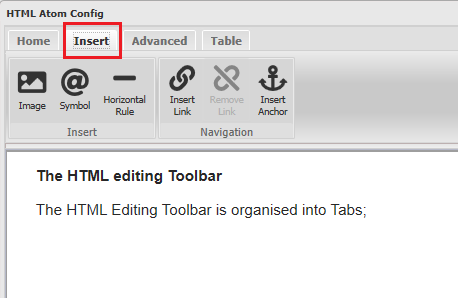
Insert Image
Inserting Images into the HTML content using this tool is covered in a separate Help Resource.
Insert Symbol
Symbols are occasionally used in technical text. You can add Symbols from a list provided in the HTML atom editor.
Insert Horizontal Rule
You can add a horizontal line into your text - useful for breaking up long sections of text or stressing paragraphs.
Create Link
Links are covered in a separate Help Resource
Remove Link
Links are covered in a separate Help Resource
Anchor
Anchors are link references that can be placed on web pages to enable rapid navigation around - especially - long pages. You can add and name an Anchor anywhere in your text where you want your user to rapidly navigate to. Then you add a link into the text where you want to navigate FROM (type Anchor) and include the Anchor reference.
HTML Editor ADVANCED Tab
The Toolbar presented under the Advanced tab is a collection of buttons that provide further editing functions, of a slightly more advanced, less frequently used nature;
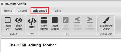
Insert / Edit Div
The Insert / Edit DIV button will put a DIV tag around the selected text / HTML element, meaning you can configure the content of the Div with discrete style. This feature is provided with options to set Style, ID and nesting.
This Tool is detailed in a Separate Help Resource.
Show Guides
This button will highlight a Div with a temporary box. Ticking the button will remove the feature.
HTML Editor
The HTML atom includes a simple HTML editor tool. This will expose the HTML that comprises the field being edited.
Atom Boxing
If you would like to quickly highlight or isolate the text that is contained by your HTML Atom, the Atom Boxing function may be of use to you.

Atom Boxed
Tick this if you want the Atom to be boxed.
Atom Icon Image
Select an Image from the back end of the website and this will appear at the top left hand corner of the atom as a Box Identifier
Atom Title
This text will appear at the top of the Atom / box
Boxing Background
There are three options for putting colour as the background of the Atom / box. We have provided two pre-configured options. Alternatively you can set up /pick your own colour by selecting the Custom Background option.
Custom Boxing Background
Click the drop down arrow to open the standard colour picker and select a colour you require for your Atom background.
Custom Boxing Label Background
Click the drop down arrow to open the standard colour picker, to select a colour that will display behind the image you select for the top left hand corner of the atom.
Insert / Edit Widget
Insert / Edit Function
Background Colour
HTML Editor TABLE Tab
The layout of pages and technical information is often suited to a table structure. You can use this feature of the HTML Editor to add and configure tables.
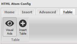
Note, when a table is added to a page, clicking on the table will result in additional table formatting tools appearing under this Tab;
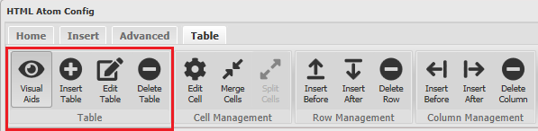
The Table Group
The Table group provides buttons that control the Table you have added
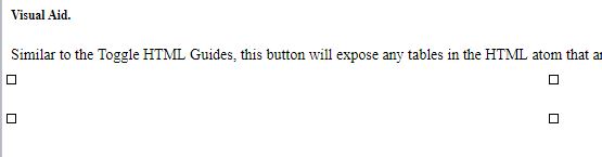
Visual Aid.
Similar to the Toggle HTML Guides, this button will expose any tables in the HTML atom that are present but don't have any borders set to display;
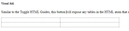
When the Visual Aid is switched off, the table has no borders, it will effectively be invisible. If you click on the table, all you will see is;
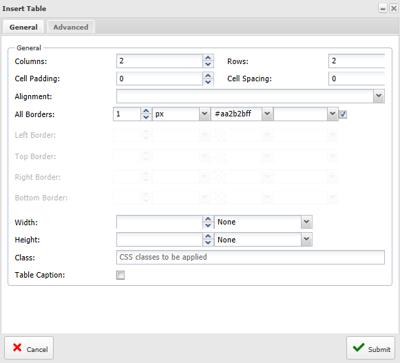
Insert Table
This button opens a form that provides the settings to configure a new table. The form has two tabs, General and Advanced.
Most (common) Table configuration actions are provided under General tab;
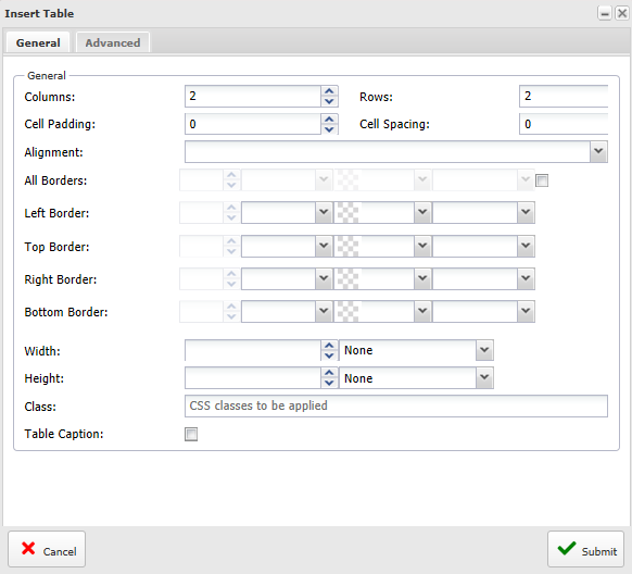
Columns
Set the number of columns you require in your table.
Rows
Set the number of Rows you want for your table.
Cell Padding
The Cell Padding is the gap between the cell wall and the content inside the cell
Cell Spacing
The cell spacing attribute specifies the space, in pixels, between cells. Note: Do not confuse this with the cellpadding attribute, which specifies the space between the cell wall and the cell content. The cellspacing attribute of a cell is not supported in HTML5.
Alignment
This attribute sets how the contents of a cell are aligned within the cell space.
All Borders
Click the checkbox at the end of this row and you will be enabled with the ability to set the properties for the borders of ALL of the tables cells.
The individual settings are for;
1. The width (in pixels) of the border
2. The Width units of the border. If px not selected then the pixel setting will disappear Width unit options are;
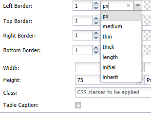
Border line options - px. The width of the border in pixels. This selection will enable the number thickness setting option.
Border line options - Medium Specifies a medium border - this is the default
Border line options - thin Specifies a thin border
Border line options - thick Specifies a thick border
Border line options - length Allows you to define the thickness of the border
Border line options - initial Sets this property to its default value. Example, set the text colour of the <div> element to red, but keep the initial colour for <h1> elements
Border line options - inherit Inherits this property from its parent element. Example, set the text-colour for <span> elements to blue, except those inside elements with class="extra":
3. The Colour of the Table / cell borders can be set to any required variation, using the standard XPOR colour picker control.
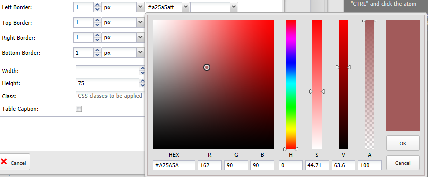
When setting the colour using the colour picker, remember to click the Tick button when you have made your selection.
Left Border
As above but specific to the Left Border of cells.
Top Border
As above but specific to the Top Border of cells.
Right Border
As above but specific to the Right Border of cells.
Bottom Border
As above but specific to the Bottom Border of cells.
Width
The width of the table can be set as pixels. In the screenshot below, the user is setting the table to be 800 pixels wide. It will be fixed to this, and will not react to the viewing screen size.
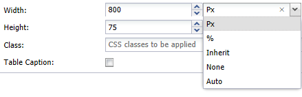
Alternatively you can;
1. set the table to occupy a percentage of the screen (width) that is viewing it. Then, when the screen is adjusted or the table is viewed on a different device, the table will adjust accordingly.
2. set the table to fit exactly into anything it is contained in (e.g. a <div>)
3. set the width to NONE - this is being deprecated.
4. set the width to be automatically calculated by the browser.
Height
Sets the height of the Table. Most of these options result in the table calculating its' height. Only the Pixel (px) option will set the height of a table to be restricted.
Class
You can select a style sheet Class to configure the table. This will override any of the settings described above. Please refer to the Help Resourcees for "Themes" and "Stylesheets" for further guidance.
Table Caption
Not currently enabled.
The Advanced Tab provides access to additional functions requiring a little more knowledge on HTML and website styles.
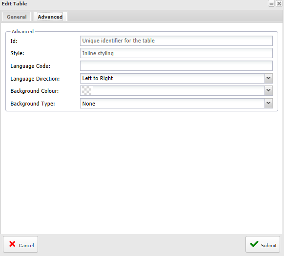
Id
You can give the table an ID - which can subsequently be used to locate the table from other web pages.
Style
If you are using a style sheet approach to controlling how our table is presented, you can select your pre-prepared Style Sheet here.
Language Code
XPOR can handle multi-lingual web pages. You can select a language code to be applied to the table, such that this language character set is used by default on the table.
Language Direction
Set this to control the direction in which the characters are read / presented in the table.
Background Colour
Use this set a background colour for the Table
Background Type
Use this to set whether you want to have an image as the background to your table. You can select if you want this to be an internal (stored in XPOR) image or an external image - from another website, or no image at all (default). Note that this feature does not scale the image to fit the table. In the event that the image is larger than the table, it will be cropped. Likewise if the image is smaller than the table, it will be repeated to fill in the table.
Table Quick Link function.
Some of the table editing functions are presented to the editor as soon as the table is clicked. This provides rapid access to the key functions. Note, each tool button has a mouse-over description to assist in selection of the appropriate function.
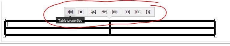
These functions mirror the functions described in this Help Resource but with slightly differnet details editing forms.
Table Group - Edit Table
This button re-opens the form that was used to create the Table (as above). However, it has the Row / Column count disabled. You cannot add rows or columns to the table as you did when you first set up the table. You must now use the subsequent buttons (see below).
Table Group - Delete Table
This button will entirely delete the selected table.
Cells Management Group - Edit Cell
This button will open the same editing functions described above - but for the selected table cell. this is a
One variation of note is that this is where you can select how the cell handles VERTICAL alignment.
Cells Management Group - Merge Cells
There are two methods for merging table cells. Firstly you can click into a Cell and click the Merge Cells button. This will open a small form;
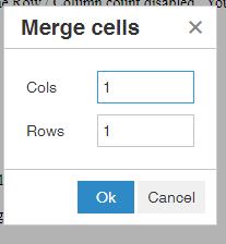
Set the number of cells you want to merge, starting with the selected cell and moving to the left or beneath the selected cell.
The number is set to 1 by default. This will not merge any cells - 2 is the number to merge TWO cells together etc.
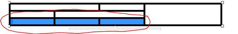
The alternative method is to click the first cell you wish to merge and drag across / down to the subsequent cells to select all cells you wish to merge. Then click the Merge Cells button. This will merge the selected cells.
Cells Management Group - Split Cells
You can use this tool to split cells into multiple other cells, either vertically or horizontally.
Rows Management Group
Use these buttons in this group to add or delete Rows in your table
Columns Management Group
Use these buttons in this group to add or delete Rows in your table.